– Chart Of The Day: For Spain, The Real Pain May Be Just Beginning (ZeroHedge, Aug 28, 2012)
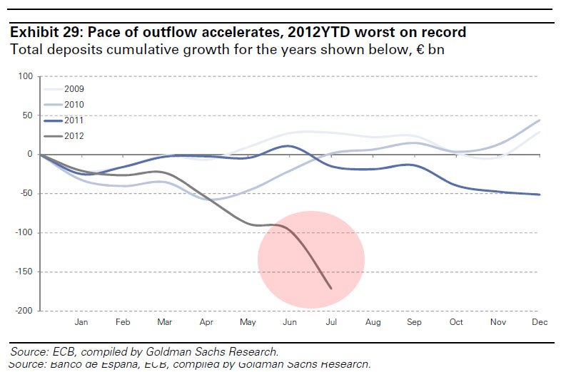
Up until now, the title of “Spain’s scariest chart” belonged to one depicting its youth (and general) unemployment, both of which are so off the charts it is not even funny (especially to those millions of Spaniards who are currently unemployed). As of today we have a contender for joint ownership of said title – Spain’s monthly deposit outflows, which in July hit the highest amount ever, and where the YTD deposit outflow is now the highest on record. One look at the chart below confirms that nobody in Spain got the June 29 Euro summit memo that “Europe is fixed”…
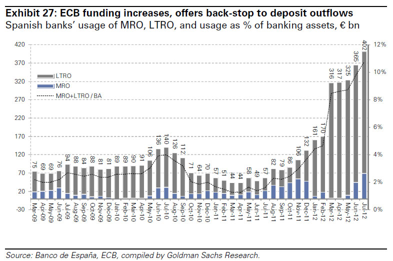
And some other ugly charts confirming memo non-receipt:


