Keynesianism (Deficit Spending, Obamanomics) in general is outdated and wrong.
Interesting article nevertheless.
The latest U.S. Treasury Z1 Flow of Funds report was released on March 11, 2010, bringing the data current through the end of 2009. What follows is the most important chart of your lifetime. It relegates almost all modern economists and economic theory to the dustbin of history. Any economic theory, formula, or relationship that does not consider this non-linear relationship of DEBT and phase transition is destined to fail.
It explains the “jobless” recoveries of the past and how each recent economic cycle produces higher money figures, yet lower employment. It explains why we are seeing debt driven events that circle the globe. It explains the psychological uneasiness that underpins this point in history, the elephant in the room that nobody sees or can describe.
(Click on images to enlarge.)
This is a very simple chart. It takes the change in GDP and divides it by the change in Debt. What it shows is how much productivity is gained by infusing $1 of debt into our debt backed money system.
Back in the early 1960s a dollar of new debt added almost a dollar to the nation’s output of goods and services. As more debt enters the system the productivity gained by new debt diminishes. This produced a path that was following a diminishing line targeting ZERO in the year 2015. This meant that we could expect that each new dollar of debt added in the year 2015 would add NOTHING to our productivity.
Then a funny thing happened along the way. Macroeconomic DEBT SATURATION occurred causing a phase transition with our debt relationship. This is because total income can no longer support total debt. In the third quarter of 2009 each dollar of debt added produced NEGATIVE 15 cents of productivity, and at the end of 2009, each dollar of new debt now SUBTRACTS 45 cents from GDP!
This is mathematical PROOF that debt saturation has occurred. Continuing to add debt into a saturated system, where all money is debt, leads only to future defaults and to higher unemployment.
This is the dilemma created by our top down debt backed money structure. Because all money is backed by a liability, and carries interest, it guarantees mathematically that there will be losers and that the system will eventually reach the natural limits, the ability of incomes to service debt.
The data for the diminishing productivity of debt chart comes from the U.S. Treasury’s latest Z1 data, the complete report is posted below:
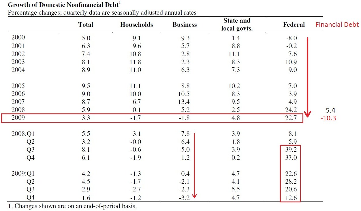
On page two of that report is the following table showing the Growth of Non Financial Debt:
I included Financial debt onto the end of the table, that data comes from page 14 of the Z1 report.
This table makes clear what is happening. Business, household, and financial debt is trying to cleanse itself, to bring the level of debt back within the ability of incomes to support it. Our governments, armed with people who cannot explain the common sense behind debt saturation, are attempting to compensate by producing prolific amounts of Governmental debt.
They feel they must do this because if they do not, then debt and money – since debt backs our money – would both decrease and that would cause the economy to slow. But by adding money, and debt, they have created a sovereign issue where our nation’s income cannot possibly service our nation’s debt. In just the month of February, for example, our nation took in $107 billion, but spent $328 billion, a $221 billion shortfall. That one month shortfall exceeds all the combined shortfalls of the entire Nixon Administration – one month.
This is like an individual earning $5,000 but spending $15,000 a month. Would you lend your money to such an individual?
Last year we spent just under $400 billion on interest on our current debt, plus we spend another $1.5 Trillion buying down rates via Freddie, Fannie, and Quantitative Easing. That’s $1.9 Trillion spent on interest, most of which wound up in the hands of the central banks and their surrogates. Compared to our $2.2 Trillion in income, interest expense last year nearly took it all. That means that nearly all your productive effort used to pay Federal taxes last year were transferred to the central banks.
Modern monetary theory does not understand, nor does it correctly describe the debt backed money world in which we live. Velocity, for example, slows as debt saturation occurs. This is only common sense, and yet the formulas do not account for the bad math of debt, nor its non linear function. Velocity is blamed partially on the psychology of “consumers.” What nonsense. It is as mechanical as the engine in your car, it was designed that way. Once people, businesses, and governments become saturated with debt, new money/ debt when introduced can only be used to service prior existing debt.
Thus money creation at the saturation point stops adding to productive efforts and becomes a roll-over affair with only the financial services industry profiting via interest and fees. In other words, money goes out and circles right back around to the banks instead of rippling through a healthy non saturated economy. If you cannot follow that most simple logic, then going to Harvard will not help you.
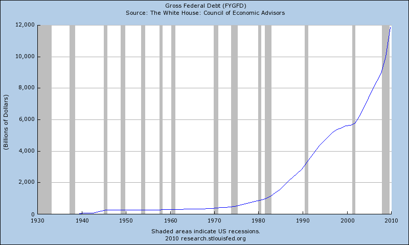
Below is a chart of the Gross Federal Debt, it is now $12.6 Trillion dollars and headed straight up, a classic parabolic rise:
Below is a chart of the Gross Federal Debt expressed in year-over-year change in billions of dollars. The same phase transition of debt saturation is clear as a bell.
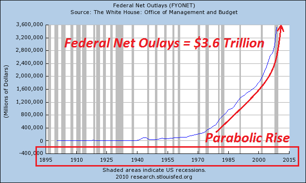
Below is a chart of Federal Net Outlays, parabolic and again headed straight up:
Clearly this is not sustainable and that means that change to our monetary system is rapidly approaching. No, it will not be left to your children or your grandchildren. It is an immediate problem and fortunately there is an immediate solution. That solution is called “Freedom’s Vision.” It can be found at SwarmUSA.com.
That chart of diminishing returns is the window to understanding why humankind is trapped in a central banker debt backed money box. No money for NASA manned space flight – NASA’s total budget a puny $18 billion in comparison to the $1.9 Trillion that went to service the bankers last year. One half the schools closing in Kansas City, states whose debts and budget deficits seem insurmountable all pale in comparison to how much money went to service the use of our own money system.
It doesn’t have to be like that, in fact it’s a ridiculous notion that the people of the United States, or any country, should pay private individuals for the use of their money system. Ridiculous!
It’s difficult to see this from inside the box, so let’s look at what happened to Iceland to illustrate. The central banks of the world created financial engineered products and brought them to the banks of Iceland. These products created a boom in the amount of credit. Prices of everything rose, and the people of Iceland then had no choice but to go along for the bubble ride. Then with incomes no longer able to service the bubble debt, the bubble collapsed.
To “save the day,” the IMF and central bankers around the world rushed in to “rescue” the people, banks, and government of Iceland. They did this by offering loans… documents that create money simply by signing a contract of debt servitude. That contract demanded ownership of Iceland’s infrastructure such as their geothermal electrical generating plants. It also demanded the future productivity of the people of Iceland in that they should work and pay high taxes for decades to pay back this “debt.” Debt that they did not create or agree to service in the first place!
There were some wise people who saw through this central banker game and started a movement. They DEMANDED that the President of Iceland put the debt servitude to a vote and the people wisely said, “Central Bankers Pound Sand!”
Thus they now control their own destiny, their future productive efforts still belong to them.
It’s easy to see from the outside looking in, but it’s not so easy to see that it’s EXACTLY the same thing occurring in the United States and no one is rising up to stop it. No one, that is, except the movement of people at SwarmUSA.com.
To all the naysayers who think the people do not have the power to make the change, I say take a look at history and how humankind has overcome its obstacles to progress with each new step. Mankind is now teetering between the brink and the dawn of a new renaissance. A new renaissance is coming because mankind is about to free itself from the chains of needless debt that are holding humanity back.
Saturday, March 20, 2010
Source: Nathan’s Economic Edge


1 thought on “US: THE Most Important Chart of the CENTURY”