– Stunning Maps Depict Collapse Of Obamacare “Coverage” In 2017:
Remember when Obama toured around the country telling everyone that Obamacare was going to increase competition and lower premiums? If not, here is an example to help jog your memory (comments taken from Obama remarks delivered at Prince George’s Community College on 9/26/13):
Now, this is real simple. It’s a website where you can compare and purchase affordable health insurance plans, side-by-side, the same way you shop for a plane ticket on Kayak — (laughter) — same way you shop for a TV on Amazon. You just go on and you start looking, and here are all the options.
It’s buying insurance on the private market, but because now you’re part of a big group plan — everybody in Maryland is all logging in and taking a look at the prices — you’ve got new choices. Now you’ve got new competition, because insurers want your business. And that means you will have cheaper prices. (Applause.)
Well, as we’ve pointed out numerous times things are not really playing out as Obama had hoped with premiums skyrocketing (see “Obamacare On “Verge Of Collapse” As Premiums Set To Soar Again In 2017“) and “competition” collapsing (see “Tennessee Insurance Commissioner Warns Obamacare “Very Near Collapse“”).
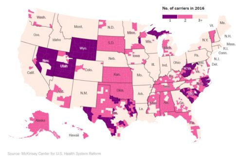
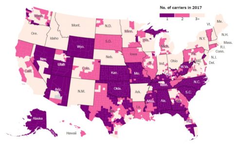
The two maps below prove that point beautifully by illustrating the epic collapse of Obamacare coverage in just 1 year. A collapse that will leave a stunning number of people across the country with only 1 option for health insurance. Meanwhile, healthcare shoppers in Pinal
County, Arizona will actually be left with no options in 2017 as all carriers have abandoned service there. (charts per the New York Times)2016 healthcare insurance carriers by county:
2017 healthcare insurance carriers by county:
Meanwhile, the Obama administration continues to insist that all is well with the Affordable Care Act. Per the New York Times:
The Obama administration says it is too early to evaluate competition in the Obamacare markets for 2017. Marjorie Connolly, a spokeswoman for the Department of Health and Human Services, said: “A number of steps remain before the full picture of marketplace competition and prices are known. Regardless, we remain confident that the majority of marketplace consumers will have multiple choices and will be able to select a plan for less than $75 per month when Open Enrollment begins Nov. 1.”
The first step is admitting you have a problem.
* * *
PayPal: Donate in USD
PayPal: Donate in EUR
PayPal: Donate in GBP


Isn’t it sad how greed for power & wealth destroy everything designed to benefit the ordinary person in these modern times?
In UK our National Health Service, which has been a benevolent standard of social health for the population has been steadily eroded by Milton Friedman based successive “Conservative” sell offs, which will soon result in its collapse, leading to the original US based Insurance funded system.
The idea of Obamacare could never, ever work in the greed based USA.
http://americanfreepress.net/obamacare-is-dying-a-slow-death/