– Chart Of The Day: 803 Years Of Global Inflation (ZeroHedge, Sep 4, 2012):
Spot the point in this 803 year timeline of world inflation, when the Fed was created.
The chart above comes courtesy of Jim Reid’s fantastic “Journey into the Unknown” which we will dissect in much more detail shortly. For now we wanted to bring our readers attention to what is arguably the most important aspect of modern monetary times: the advent of persistent inflation, and the disappearance of deflation.
Figure 18 shows median global inflation first from 1209 (left) and then from 1900 (right). As we’ve discussed in previous notes inflation took on a totally different persona after the start of the twentieth century. The charts are again on a log scale to allow us to easily see the near exponential increase in inflation over the last 100 years or so, especially relative to what occurred before. Note that had we used average instead of median, the chart would look almost absurd given the extreme levels of hyperinflation seen in several countries over the last century. The data behind the graph is based on a full set of 24 countries where we have inflation data back to 19001. Prior to this many countries have data that goes back several decades with some back through the centuries. We have included data as and when it becomes available.
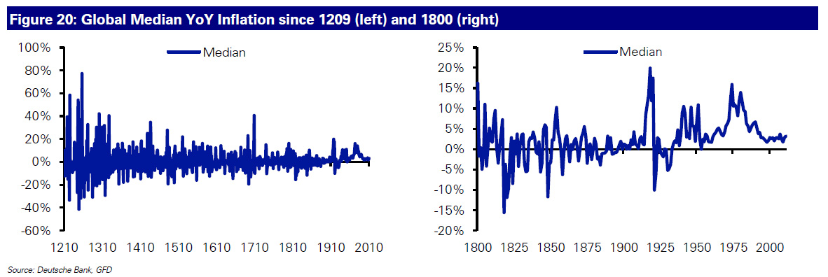
It’s not just the general trend of higher prices, it’s the fact that even single years of deflation have been increasingly hard to find globally over the last century. Figure 20 shows the same data set as used above but shows the median YoY inflation back to 1209 (left) and over the shorter period since 1800 (right).
Prior to the twentieth century years of deflation were almost as common as years of inflation. However as discussed above, this all changed over the last 100 years or so. Indeed we haven’t seen a year of deflation on this median Global YoY measure since 1933. So we’ve now had nearly 80 years without a global year on year fall in prices.
Figure 21 extends this analysis showing the percentage of countries in our sample with a negative YoY inflation print and the total number of countries in our sample each year. The number of countries in annual deflation has certainly fallen over the last 100 years and particularly since the Gold Standard link was broken in 1971. Indeed since 1987 no more than 2 countries (out of the maximum 24 in our sample) have seen deflation in any one year and in most cases one of these two countries was Japan.
So although the last 30 years has been a period where inflation was perceived to be under control across the globe, there has generally been a persistent positive bias not seen through longer-term history. The break with Gold has ensured that countries can mostly ensure they don’t have deflation by being free to conduct money creation policies.
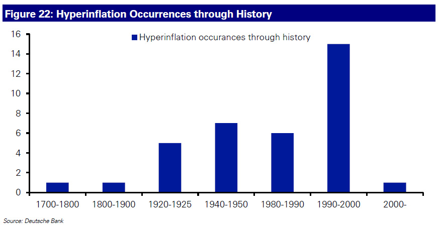
Although the hyperinflation list perhaps isn’t 100% inclusive, the trend is absolutely beyond dispute. The 1980s and 1990s saw the vast majority of the examples of these occurrences through history. Although all these have been outside of the developed world, this region has also seen many countries with high inflation over the period and with wide divergence between countries.
Much more coming: in terms of both Reid’s report, and inflation.


