And I am amused that so view people call it a DEPRESSION.
(Not only) Real unemployment numbers are at depression levels.
This is the Greatest Depression.
– US In Recession Right Here, Right Now (Global Economic Analysis, August 29, 2011):
I am amused by those who think a US recession will come within a year. Even more amusing are those who think a recession will not come at all.
The US is in a recession now. I am not the only one who thinks so.
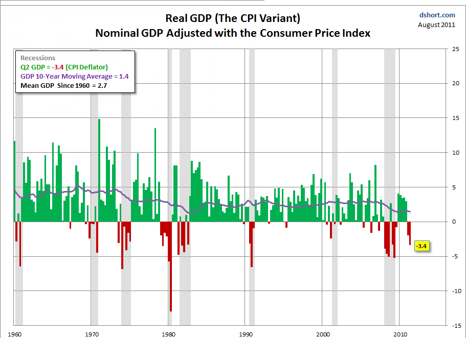
Last Friday, I received an email from Rick Davis at Consumer Metrics, complete with an Excel spreadsheet that shows that had the GDP deflator been based on the consumer price index (CPI) rather than the BEA’s measure of price inflation, the US would already be in the second quarter of contraction.
My friend Tim Wallace noted Davis’ explanation would be consistent with Petroleum Distillates Demand Shows “Definite Economic Downturn Starting April/May 2011”.
Thus Wallace was not surprised at all.
In the meantime, I received a set of emails from Doug Short. He had already charted what I was about to graph. Let’s take a look.
The Deflator Makes Big a Difference
Please consider Will the “Real” GDP Please Stand Up? by Doug Short.
How do you get from Nominal GDP to Real GDP? You subtract inflation. The Bureau of Economic Analysis (BEA) uses its own GDP deflator for this purpose, which is somewhat different from the BEA’s deflator for Personal Consumption Expenditures and quite a bit different from the better-known Bureau of Labor Statistics’ inflation gauge, the Consumer Price Index.
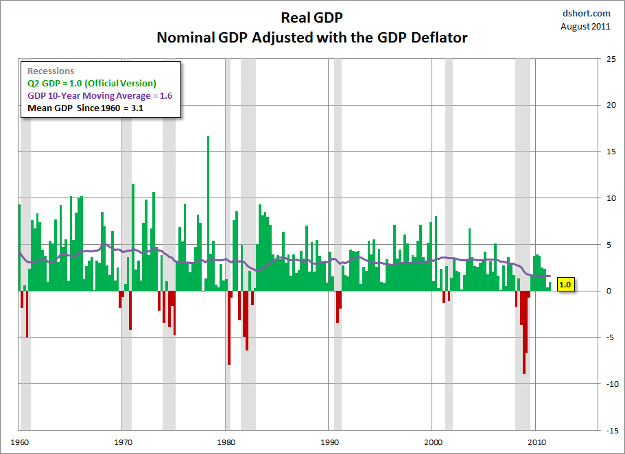
I’ve updated my charts showing quarterly Real GDP since 1960 with the official and three variant adjustment techniques. The first chart is the official series as calculated by the BEA with the GDP deflator. The second starts with nominal GDP and adjusts using the PCE Deflator, which is also a product of the BEA. The third adjusts nominal GDP with the BLS (Bureau of Labor Statistics) Consumer Price Index for Urban Consumers (CPI-U, or as I prefer, just CPI). The forth chart, a recent addition prompted by several requests, adjusts nominal GDP using the Alternate CPI published by economist John Williams at shadowstats.com
The following charts are courtesy of from Doug Short.
Real GDP With GDP Deflator
Real GDP With CPI Deflator
Recession It Is
There you have it. That is what Tim Wallace spotted, that is what Rick Davis spotted, that is what Doug Short spotted.
No one really needed a chart for this.
I have been talking about a global slowdown for a long time. My only concern was if and when the NBER would agree to admit the obvious. I still do not know, but as I have stated before, I expect the NBER to backdate the recession to this quarter or next.
That is a guess, not a certainty.
Permanent Recession Since 1988?
Doug Short also produced a chart using the CPI as calculated by John Williams at ShadowStats. Here is that chart.
As much as I think GDP is nonsense (and I really do think it is nonsense, figuring the first 2% is hedonics and imputations), Williams carries the idea to ridiculous extremes.
Doug Short politely comments “I find this ‘alternate Real’ GDP to be interesting (in a freakish sort of way), but I personally see no credibility in the hyper-negative GDP is produces.”
“Freakish” Hyperinflation Report
Please consider Williams’ Hyperinflation Special Report (Update 2010)
Risks are high for the hyperinflation beginning to break in the year ahead; it likely cannot be avoided beyond 2014.
It is this environment of rapid fiscal deterioration and related massive funding needs, the U.S. dollar remains open to a rapid and massive decline and to the dumping of U.S. Treasuries. The Federal Reserve would be forced to monetize significant sums of Treasury debt, triggering the early phases of a monetary inflation. Under such circumstance multi-trillion dollar deficits rapidly would feed into a vicious, self-feeding cycle of currency debasement and hyperinflation.
Hyperinflation When?
That was written in 2009 with an update in 2010.
Amusingly in the Hyperinflation Special Report (2011) William comments on his timeline for hyperinflation.
Outside timing on the hyperinflation remains 2014, but there is strong risk of the currency catastrophe beginning to unfold in the months ahead. It may be starting to unfold as we go to press in March 2011, but moving into a full blown hyperinflation could take months to a year, beyond the onset, depending on the developing global view of the dollar and reactions of the U.S. government and the Federal Reserve. …
The federal government and Federal Reserve’s actions in response to, and in conjunction with, the economic and financial crises of 2007, however, accelerated the ultimate process—both in terms of fiscal deterioration and global perception of the issues—moving the outside horizon for hyperinflation from 2018 to 2014.
Even so, over the last year or two, the government and Fed’s actions and policies, and economic and financial-market developments have continued to exacerbate the circumstance, such that there is significant chance of the early stages of the hyperinflation breaking in the months ahead. Key to the near-term timing remains a sharp break in the exchange rate value of the U.S. dollar, with the rest of the world effectively moving to dump the U.S. currency and dollar-denominated paper assets.
Williams Fails to Understand
- Debt-deflation
- The role of credit vs. money
- Flight to cash
- The significance of trillions of dollars in excess reserves just sitting there because banks are undercapitalized and there are to few credit-worthy borrowers
- How little power the Fed has in controlling the demand for credit (and thus inflation)
- How international trade works
Breathtaking Ignorance
That is a heck of a lot of things to not understand, but let’s focus on one critical error namely Williams’ statement “the rest of the world effectively moving to dump the U.S. currency and dollar-denominated paper assets”.
I have commented on the invalid nature of such statements at least a dozen times. Here is one from a week ago in Michael Pettis: Long-Term Outlook for China, Europe, and the World; 12 Global Predictions
Via email, Michael Pettis at China Financial Markets shared his outlook for China, Europe, and the world. The overall outlook is not pretty, and includes a breakup of the Eurozone, a major slowdown for China, and a smack-down of the much beloved BRICs.
Pettis Writes …
August is supposed to be a slow month, but of course this August has been hectic, and a lot crueler than April ever was. The US downgrade set off a storm of market volatility, along with bizarre concern in the US about whether or not China will stop buying US debt and the economic consequence if it does, and equally bizarre bluster within China about their refraining from buying more debt until the US reforms the economy and brings down debt levels.
What both sides seem to have in common is an almost breathtaking ignorance of the global balance of payment mechanisms. China cannot stop buying US debt until it engineers a major adjustment within its economy, which it is reluctant to do. Until it does, any move by the US to cut down its borrowing and spending will trigger a drop in global demand which will cause either US unemployment to rise, if the US ignores trade issues, or will cause Chinese unemployment to rise, if the US moves to counteract Chinese currency intervention.
Emphasis in red added.
Just the Math Ma’am
What Pettis states, and I have reiterated at least a dozens time is that as long as the US runs a trade deficit, US treasuries will have a bid.
This is not speculation, the statement is a near mathematical certainty. Moreover, the US Would Welcome China Not Buying US Treasuries! exactly the opposite of what hyperinflationists would have you believe.
Please read the link for a detailed explanation.
Yield Curve as of 2011-08-28
As the silly calls for near-term hyperinflation mount, I point out a chart of the yield curve.
click on chart for sharper image
Does that look like hyperinflation or does it look like deflation?
Back to the Real World
In the real world, Doug Short comments on Real GDP Per Capita, Year-over-Year Change, and the Next Recession
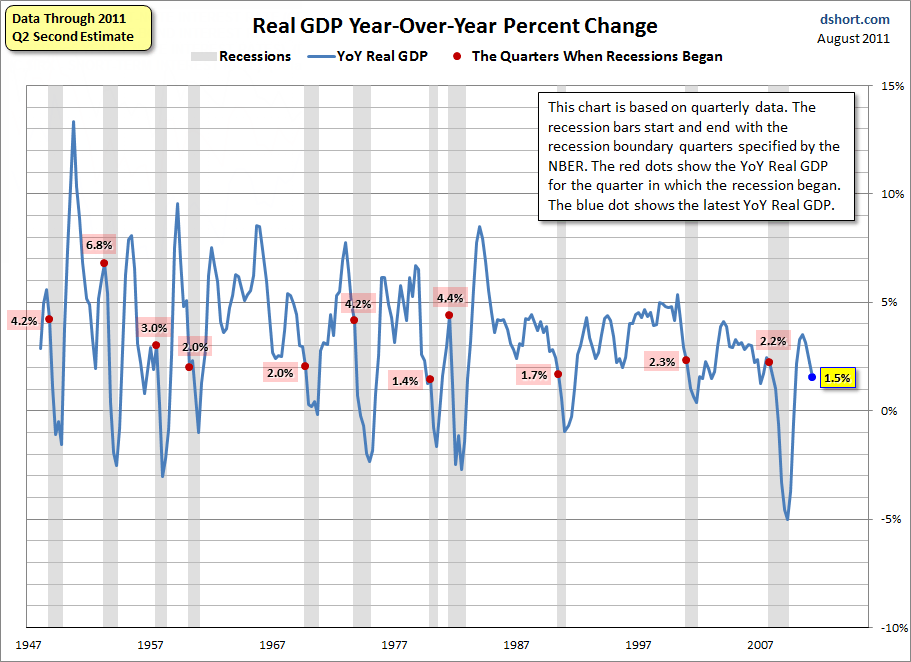
The next chart shows the YoY change in real GDP from the earliest quarterly data in 1947. I’ve again highlighted recessions. The red dots show the YoY real GDP for the quarter in which the recession began. The blue dot shows the latest YoY real GDP. Note: Unlike the previous chart, this one does not include a per-capita adjustment.
As the chart illustrates, the latest YoY real GDP, at 1.5%, is below the level at the onset of all the recessions since the first quarterly GDP was calculated — with one exception: The six-month recession in 1980 started in a quarter with lower YoY GDP (1.4% versus today’s 1.5%). And only on one occasion (Q1 2007) has YoY GDP dropped below 1.5% without a recession starting in same quarter. In that case the recession began three quarters later in December 2007.
In his 2011 Jackson Hole speech, Chairman Bernanke observed that “growth in the second half looks likely to improve.” Our look at YoY GDP percent change suggests that we must indeed see stronger second half growth to avoid the recession that now appears to be a high-probability risk. If Q3 real GDP shows a continuation of the current trend, the NBER will likely pick a month in Q2 as the beginning of a new recession.
Unless there is an immediate pickup in GDP, highly doubtful given Hurricane Irene, the NBER will backdate the recession to the second quarter, just as Tim Wallace stated.
Some analysts will blame Irene. If so, it will be just another “bullshill” excuse by analysts to avoid admitting they blew it. Bernanke may try the same ploy. If so, it will be an attempt to buy time, hoping for a miracle.
No miracles are on the horizon.
Mike “Mish” Shedlock


